
WARDEN
414th Separate Strike Unmanned Aerial Systems Brigade "Magyar's Birds" (WARDEN) is a tech military unit specializing in aerial reconnaissance, strike operations, and warfare technologies.

CHALLENGE
As the unit rapidly scaled from a specialized tactical group into a full-scale brigade, it lacked a unified identity and communication framework. To support recruitment, boost public engagement, and build a strong, recognizable brand, the brigade needed a comprehensive identity that accurately reflected its technological edge, precision, and modern approach to warfare.
SOLUTION
We created complete brand guidelines for the brigade, framing its philosophy around the concept of "WARDEN" as an architect of advantage on the battlefield that turns chaos into a controlled, high-precision system.
Project stages
- Strategic naming & concept development: formulated the concept of "WARDEN", positioning the brigade as an "Army of intellect" that prioritizes engineer-level calculation, data, and technology over blind heroism.
- Tone of voice & messaging framework: defined a direct, calm, and technological communication style based on facts, numbers, and clear actions. Established core messages emphasizing precision, control, and soldiers' lives as the highest priority.
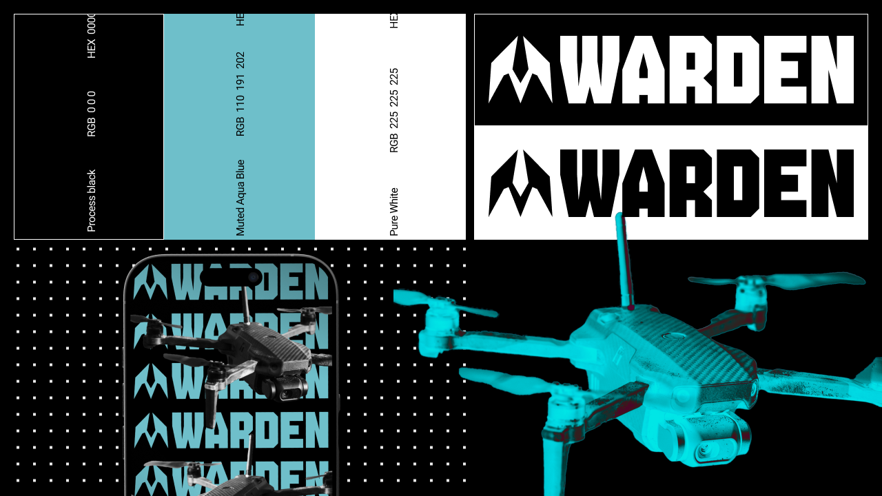
- Logo & visual identity: designed a geometric logo that blends the silhouette of a bird and a drone into a single cohesive symbol of accuracy and technological strength. Developed a clear icon version for digital interfaces and social media.
- Typography & color palette: selected bold, structured typography paired with a strict color palette featuring Process Black, Pure White, and Muted Aqua Blue.
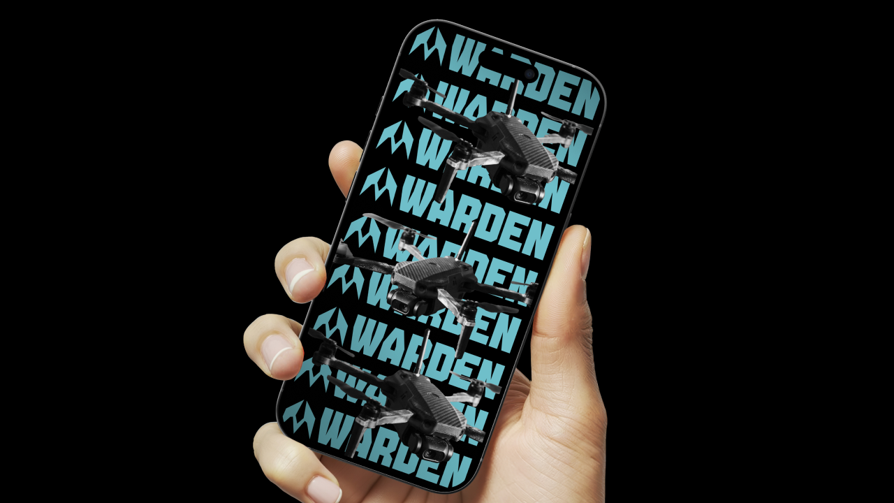
- Brand guidelines & application examples: built a complete brandbook detailing usage rules, graphic elements, prohibited modifications, and digital mockup templates for social media and communications.
RESULTS
- Built a fully structured, scalable visual identity that prepares the brigade for long-term growth and high public visibility.
- Established a cohesive and professional communication language that sets a new standard for modern military branding.
Pairing structured system thinking and clear visual geometry transforms a military unit into a brand. One rooted in technology, high trust, and deep respect for human life.